Typ-o-gra…what?
It’s ok, that word used to be foreign to me as well. Until I realized that what I had always been so interested in was called that. So what is it? For those who don’t work in the design world, or live, breath and practically dream about colors, shapes and patterns, typography in a dictionary definition, is the study of the design of typefaces, and the way in which the type is laid out on a page to best achieve the desired visual effect and to best convey the meaning of the reading matter. So pretty much, anything that involves arranging type, no matter the medium, is typography, and to me, an art.
Before I start speaking too much on important tips for working with typography, there are a few other definitions we should clarify…plus it is always good for a vocabulary refresh!
Typeface- A typeface is the complete set of type characters. This most commonly includes the letters, numbers and punctuation that may be needed. Each typeface has a name, such as Arial, Helvetica, Myriad, Franklin Gothic, etc.
Font- Fonts on the other hand, are the details making up a specific style of the typeface, which includes attributes such as bold, italicized, text size, etc. If you were creating a heading, you may chose Arial as the typeface, but the heading would have a font of Arial- bold, 20px.
Now that we have that cleared up. Here are five tips to help improve the typography, and ultimately, the readability of anything you create. Yes, this even goes for the office assistant who throws together flyers for a company. If you want a reader to gain something from what you are creating, an extra emphasis on the typography will go a long way!
1. Limit yourself. Or in other words, don’t get carried away. I get it, there are some fabulous typefaces out there, but that doesn’t mean you need to use all of them in one project. My recommendation is to limit the number of typefaces you use to two to three. It will allow the reader to better understand the organization of the piece and help their eyes flow from point to point. Consider adding bold or italic styles to the typefaces to grab attention instead of the craziest typeface you can find. For all those great typefaces you run across but do not have a use for yet, create some type of reference document that you can look to when starting a new project.
2. Make it a part of your brand. By using specific typefaces consistently in projects for a product, company or organization, you can actually add to the branding power. Find a typeface that really conveys the brand and will work on your most commonly used mediums. It can end up being as strong of a branding asset as colors, design elements and logo.
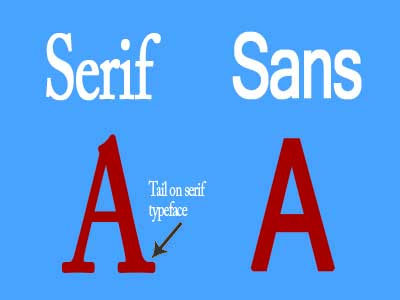
3. Mr. Sans vs. Mrs. Serif. You have probably met these both before, but not everyone understands the difference and the power each one has when used correctly. The easiest way to explain the difference is a sans font will be have simpler shapes making up the letters and numbers, where as a serif font will have a projection, or tail, at the end of a stroke. Take a look below.
The most common tip is to use a sans font for a heading, and a serif font for body text. These two variations complement each other very well, but a serif font is used for large amounts of text due to the ease of reading on the eye due to the connectivity of the letters. Sans fonts look great bold and in colors, so they do work well as headings or titles, however, they are also commonly used in body text on digital mediums due to a difference in screen resolution. Once you come across a great pair of typefaces for headings/titles and body text, keep them logged somewhere. It is a great reference tool for a project later on!
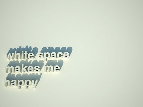
4. Type likes white space too. You have probably heard it before. White space, or negative space, is your friend. Not only is it easy on the eyes, but it also helps direct readers to the key elements you want them to read or view. Type works the same way. When given proper white space around type, you will increase the readability tremendously. Remember, just because the space is there, you do not have to fill it all up. Make it easy on the ready and inviting, don’t scare them off before they have even read the first heading.
5. Hold that capitalization! Before pressing that caps lock button, rethink what you are about to do. Sure, the word stop on a stop sign is in all capitals, and I understand that what you are creating is just as important, however, it may actually hurt the readability if you include to many consecutive capitalization. The eyes actually are slower at reading letters in complete caps in comparison with those that are not. This also goes for underlining. Somewhere along the line, underlining became the suggested way of differing a heading or title from a paragraph. But why would you want to put a line between to items that are supposed to be linked together?
I’ll get into layout tips another time and talk more on them, but for now, just remember the goal of your project is readability and allowing the readers eyes to flow easily across the medium and to be able to identify the key points. Keep this in mind and you will see a great difference in even the simple office party flyer!